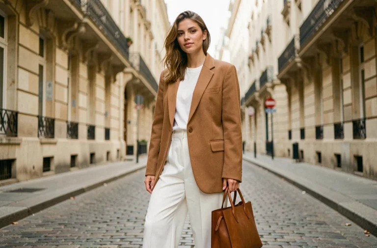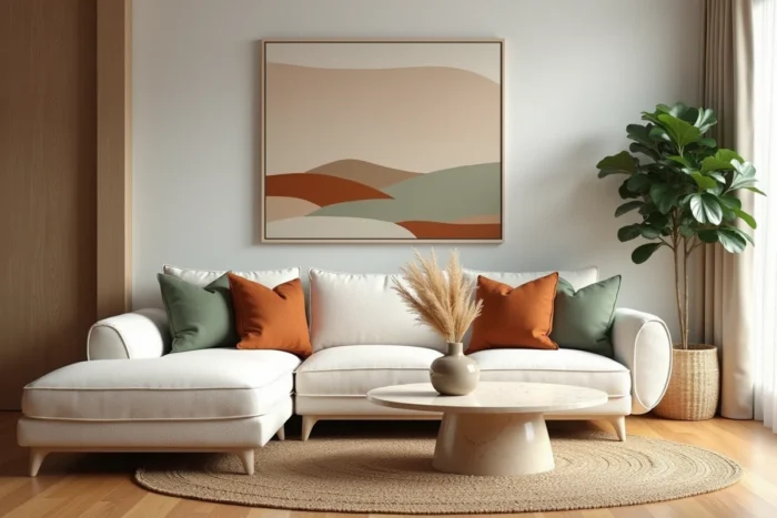
The decor trends for 2026 are no longer limited to a standout color or a featured material. Color references are proposing coordinated shade systems rather than a single tone: Pantone has chosen Cloud Dancer (a bright white), while WGSN and Coloro highlight Transformative Teal, a deep blue-green.
The result is an approach based on families of natural colors (pearl white, sage green, sienna, butter yellow) that structures decoration around a coherent palette.
Natural color palette: the 60-30-10 rule applied to decor 2026
Before choosing a sofa or lighting, the first decision concerns the color distribution of the room. The 60-30-10 rule is a central tool for colorists and decorators this year. The principle: assign a dominant shade to about six-tenths of the visible surfaces, a secondary one to three-tenths, and an accent to the remaining tenth.
In 2026, the concrete application of this rule relies on the families of natural shades mentioned above. A pearl white background (walls, ceiling, large textile surfaces) occupies the dominant position. Sage green or sienna takes the secondary role on furniture, curtains, or a wall section. The blue-green Transformative Teal or butter yellow serves as an accent on cushions, a vase, or a pendant light.
Articles published on newsdeco.com regularly detail these color combinations applied room by room, from the living room to the bedroom.
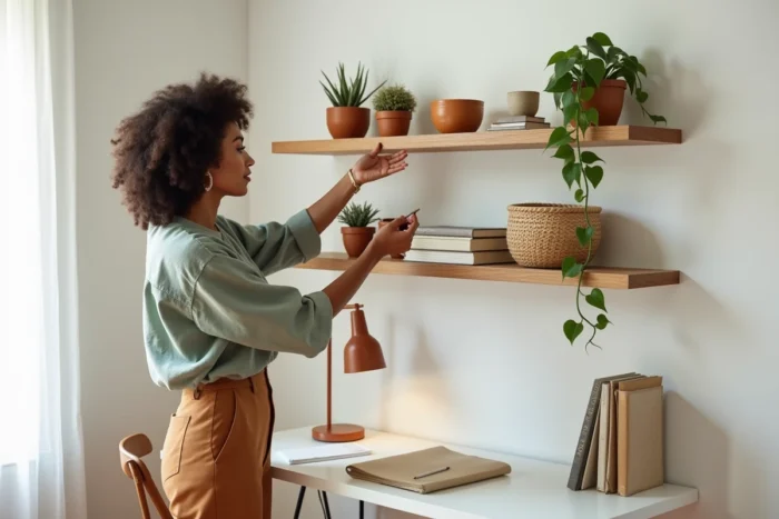
This method avoids two common mistakes: the monotony of an all-white interior and the overload of a space saturated with colors. Three shades are enough to transform a room if their proportion is well managed.
Color drenching and color capping: two decor techniques to structure an interior
Beyond the palette, the way color is applied in the space changes the perception of a room. Two techniques stand out this year.
Color drenching or color immersion
Color drenching involves applying a single shade to all surfaces of a room: walls, ceiling, woodwork, sometimes even the floor. The goal is not to create contrast but to achieve an enveloping effect. A living room entirely treated in sage green gives a cocooning sensation that a simple accent wall paint does not produce.
This technique works best in modestly sized rooms. The smaller the volume, the more effective the immersion, as the absence of visual breaks enlarges the perceived space.
Color capping
Color capping takes the opposite approach: the color stops at a horizontal line, usually two-thirds up the wall, and the ceiling remains in a lighter tone. This visual cut lowers the perceived height, which is suitable for rooms with large volumes or high-ceilinged hallways.
Specifically, a band of sienna that stops below the molding, with a pearl white ceiling, creates a warm visual base without overwhelming the natural brightness.
Handcrafted furniture and raw materials: the decor style replacing all-industrial
Mass-produced furniture and ultra-smooth finishes are giving way to pieces with artisanal character. Wood, ceramics, linen, rattan, and local stone are becoming leading materials in interior decoration for 2026.
- Raw or lightly brushed wood replaces uniform veneers on tables, consoles, and shelves. Local species (oak, walnut, ash) are favored for their visible grain and natural patina.
- Handcrafted ceramics (decorative tableware, plant pots, wall tiles) bring surface irregularities that break the industrial perfection and add depth to open shelves.
- Natural textiles (washed linen, ecru cotton, boucle wool) replace synthetic fabrics on sofas, curtains, and cushions, with textures visible to the touch and eye.
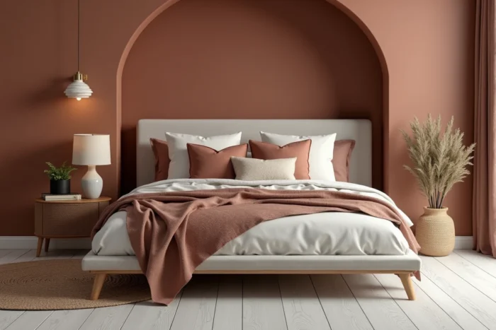
This shift towards craftsmanship is not just aesthetic. Trade shows for furniture indicate a growing demand for traceable pieces made in identified workshops. The origin of the furniture is becoming a decor criterion on par with its shape.
Boundary between indoor and outdoor: the living room extended onto the terrace
The most structuring trend of 2026 is not an object but a principle of layout: continuity between indoor and outdoor spaces. The outdoor furniture market is experiencing notable growth, driven by collections that adopt the codes of the living room (modular sofas, coffee tables, outdoor rugs, rechargeable lighting).
The principle of zoning, popularized in interior decoration, is now extending to terraces and gardens. The technique involves delineating functional areas (dining, relaxation, reading) without partitions, using rugs, planters, or changes in flooring.
The choice of materials links inside and outside. The same wood (teak, acacia) used for the dining table and the terrace table creates a fluid reading of the space. Bioclimatic pergolas with adjustable slats extend this logic by allowing light modulation as one would with indoor blinds.
Outdoor decoration also borrows its accessories from the living room: cushions in water-repellent fabrics echoing the shades of the indoor palette, solar pendants with designs identical to the living room fixtures, decorative ceramics placed on an outdoor console.
The guiding idea is simple: the terrace is no longer an afterthought but a room to decorate with the same rigor as the living room. This change in approach modifies budgets and layout priorities, placing the outdoors at the center of the decor project rather than at the bottom of the list.
Natural palettes, color application techniques, the return of craftsmanship, and the blurring of the indoor-outdoor boundary form a coherent whole. The common thread remains the same: prioritize tangible materials, shades derived from nature, and spaces designed as a whole rather than room by room.